Head of creative direction for self-started Boston creative arts magazine
Created using Adobe InDesign, Illustrator, Photoshop
Created using Adobe InDesign, Illustrator, Photoshop
THE PLATFORM
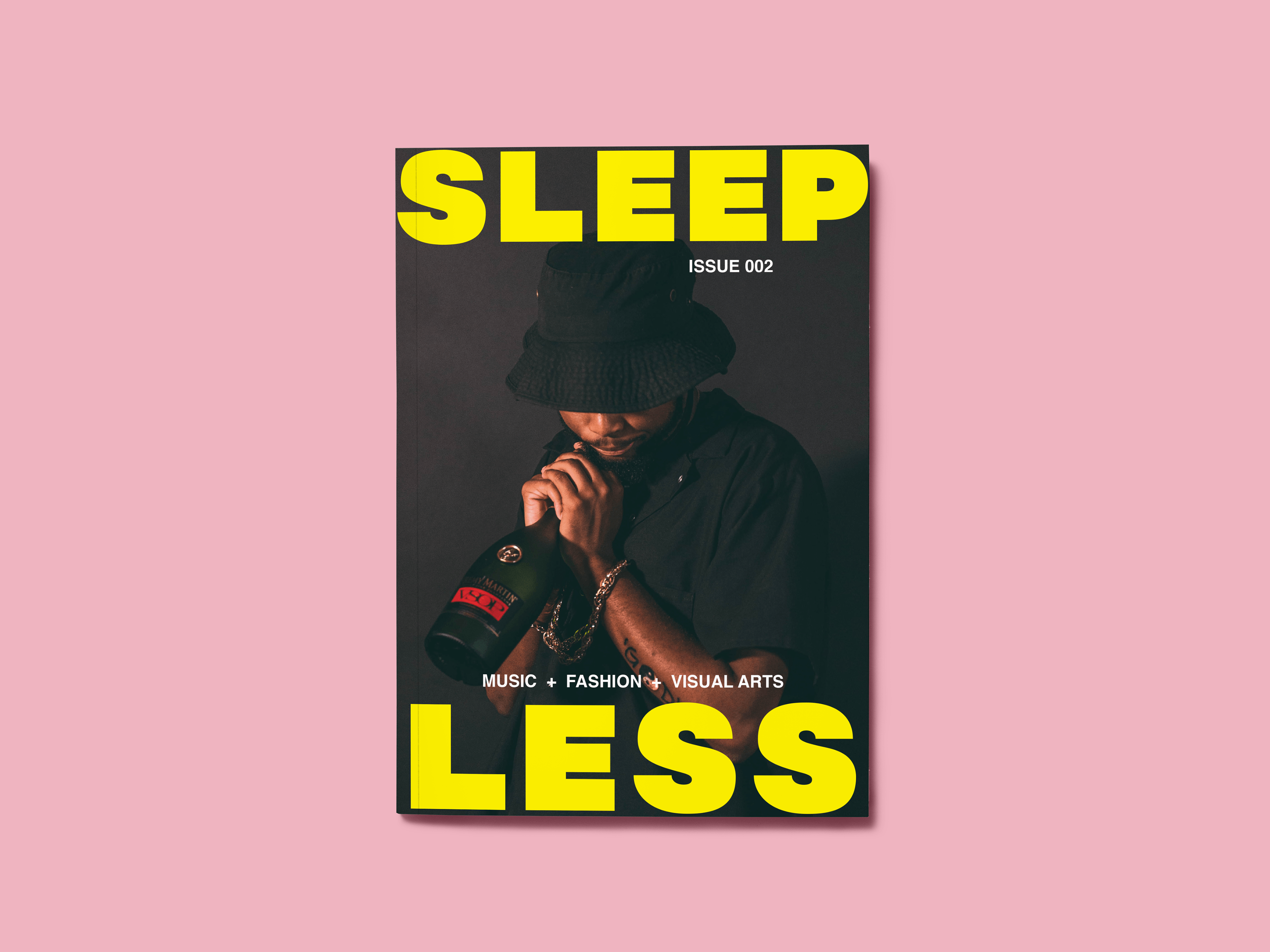
Sleepless Boston is a magazine and creative community created by a few friends and me. The magazine, which just finished its second cycle of production and began in the spring of 2019, is centered around bringing attention to the arts community of Boston. We focus our content largely on the music, fashion, and visual arts scenes of the city.
The magazine initially began as a passion project. We noticed that although Boston was recognized as a major U.S. city, our arts scene didn't receive the same attention as other major cities like New York City or Los Angeles. But, upon inspection (which included attending as many local shows and exhibitions by local artists as we could), we found this was not because of a lack of talent; Boston artists are plenty talented. We discovered there wasn't an adequate platform for these artists to be recognized for their work, or even to publicize their work. Sleepless is all about giving these artists that type of platform.
THE DISTRIBUTION
We sold about 100 copies of our first issue, at $20 per issue. With our second issue, our sales exponentially increased: we sold 500 copies at $15 per issue. Our distribution of our second issue also expanded to local stores in Boston that bought and sold our magazine to its customers at a discounted price. Ultimately, we've made a name for ourselves in the Boston arts community, even with just under a year into the business.
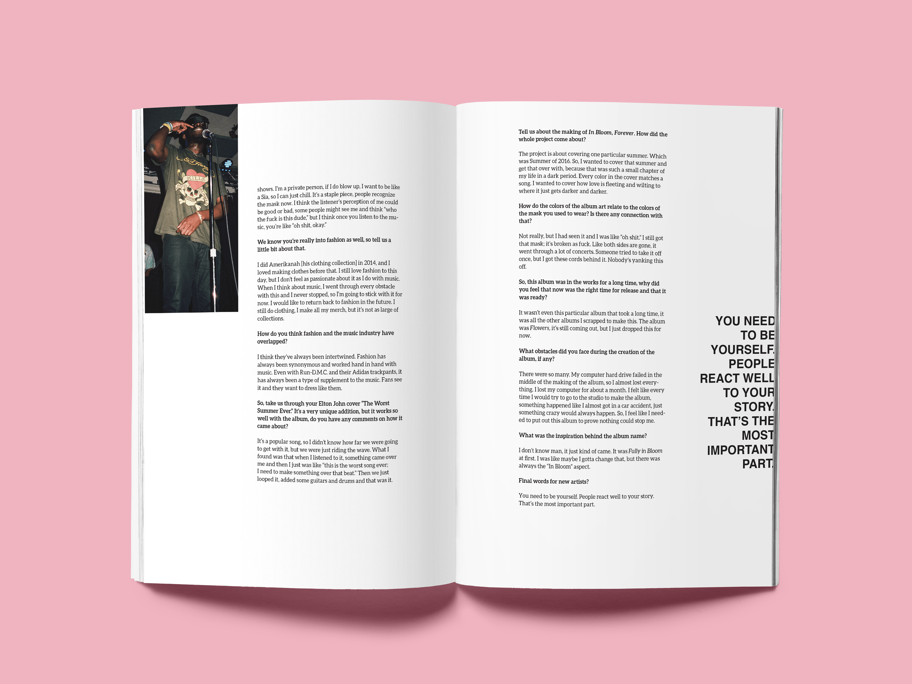
THE DESIGN PROCESS
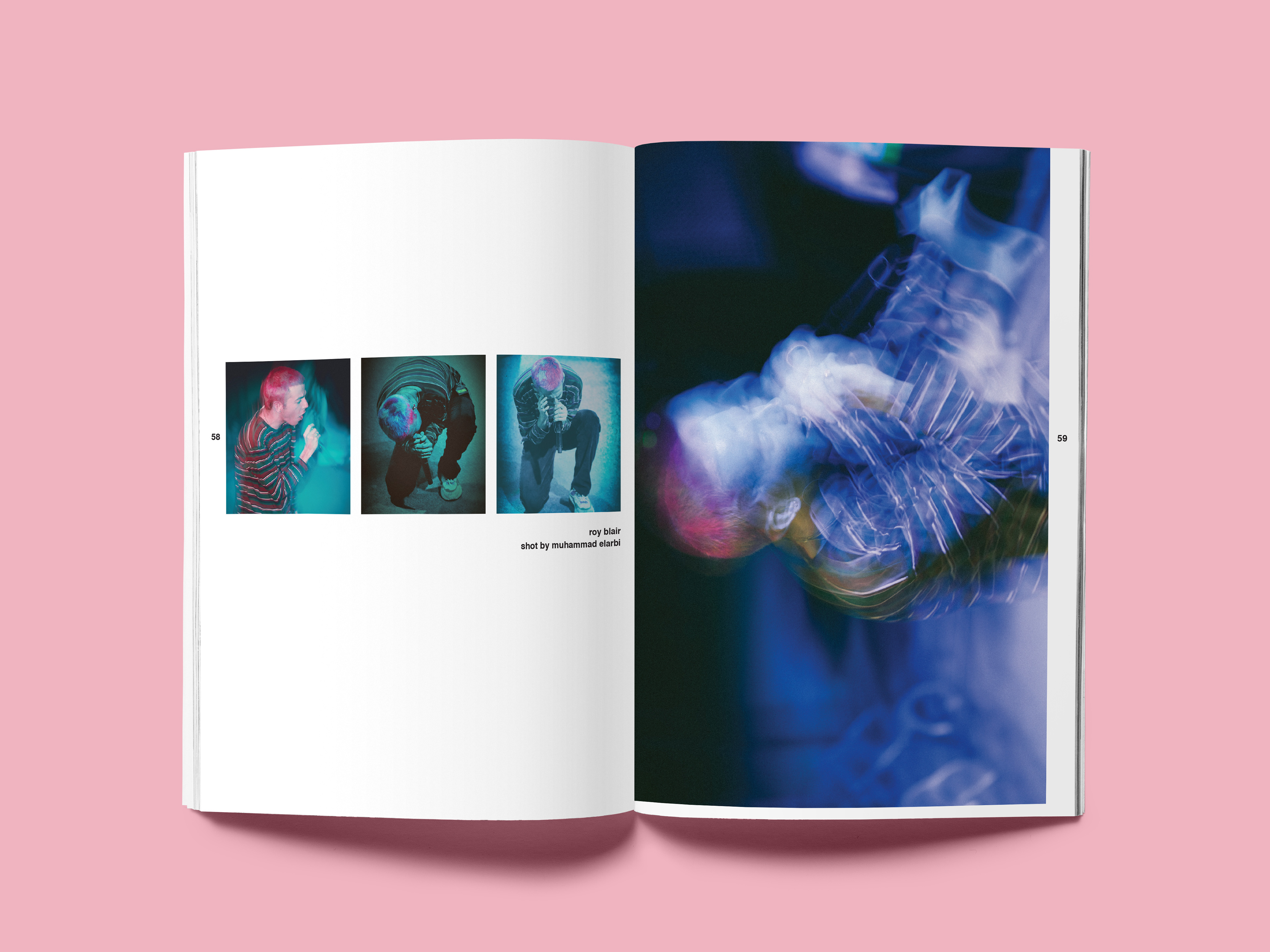
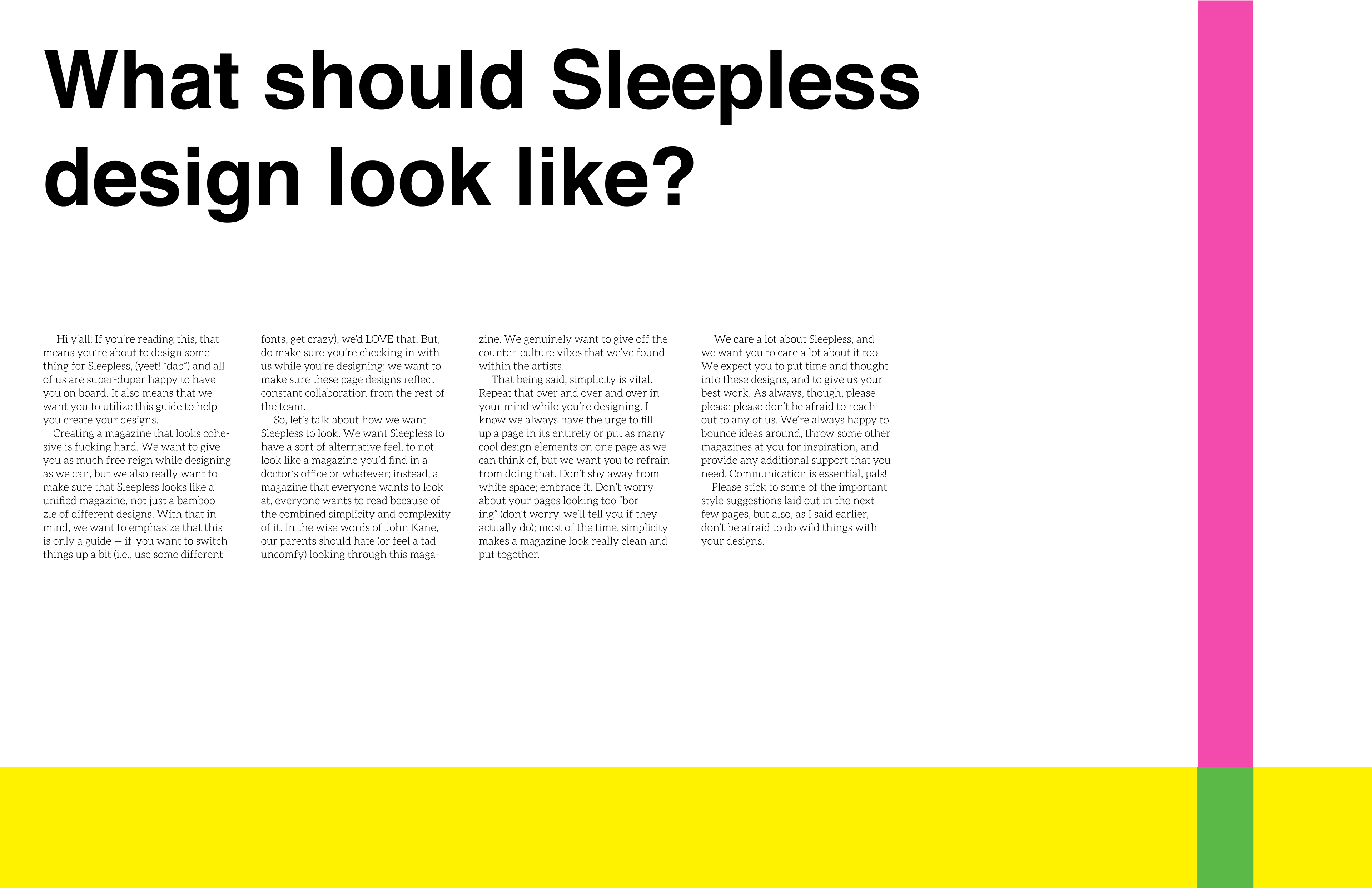
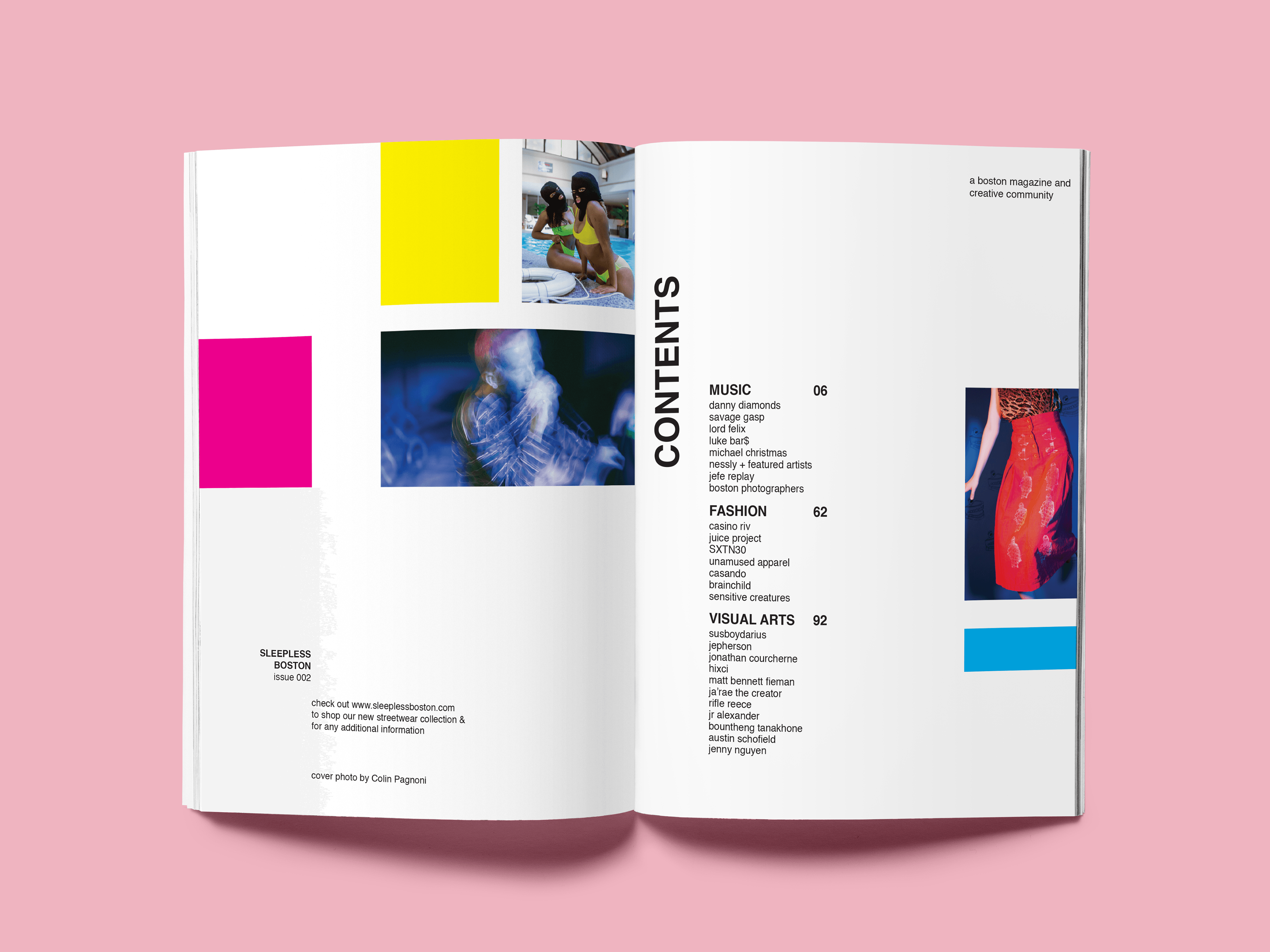
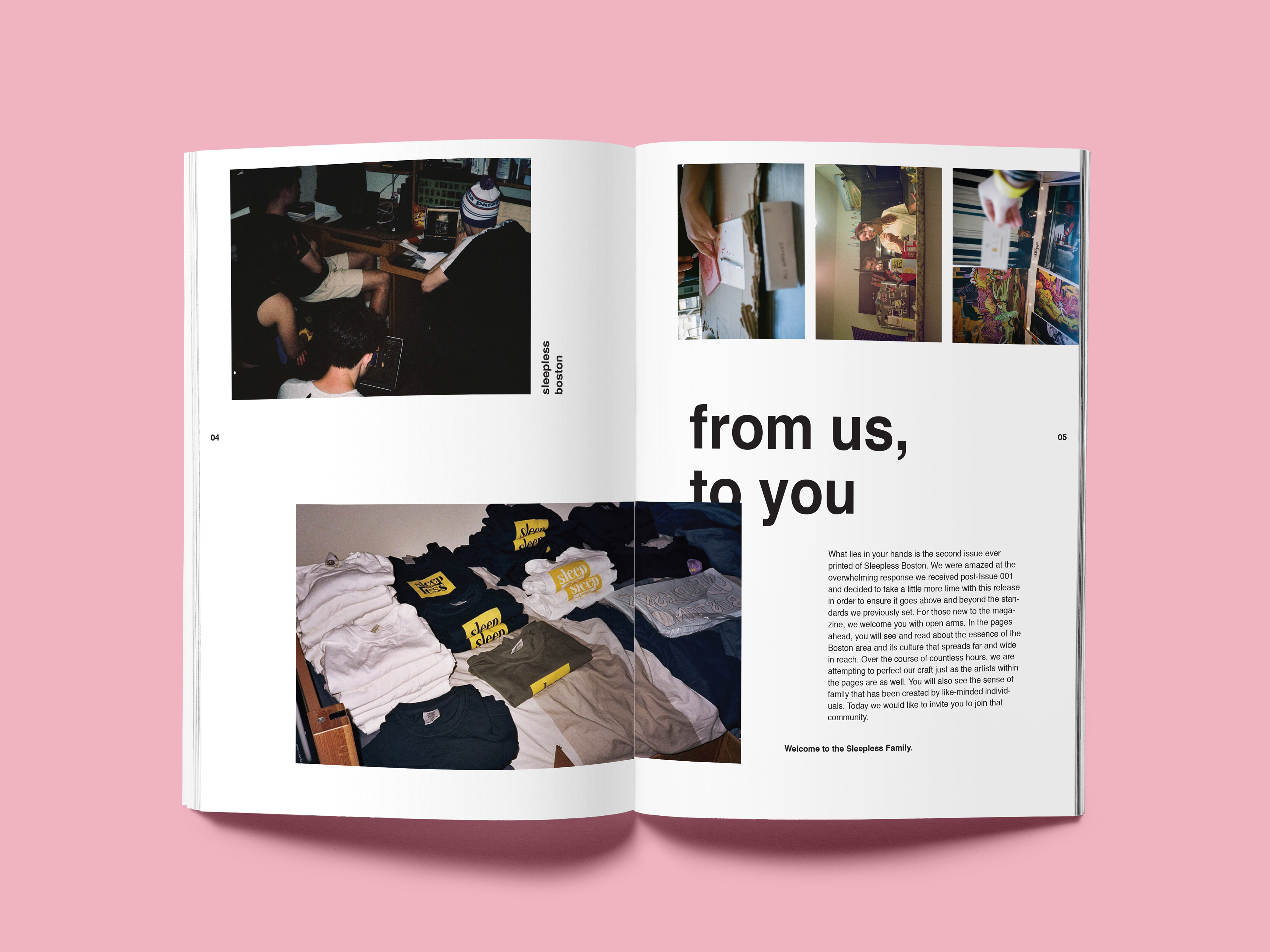
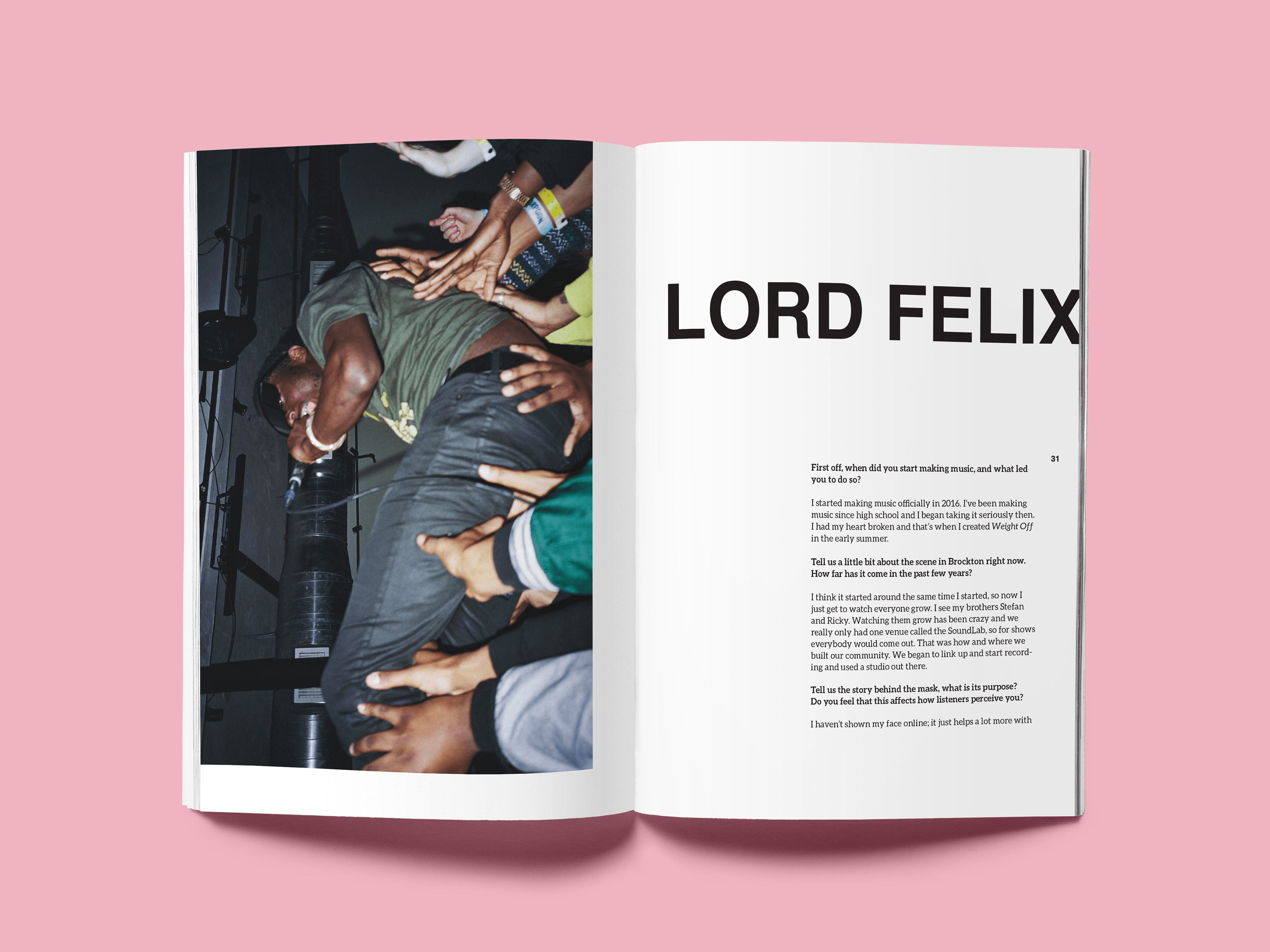
As an initial entrepreneur and the first creative director for the magazine, I was tasked with setting the style and tone for the overall design. I decided on an ultimate simple design. We wanted to focus primarily on the content of the magazine, such as the photos and text, rather than the design itself. I wanted the design to not be noticed — to be so simple that readers would focus on the images and content. But, I still wanted the magazine to look unified as a whole.
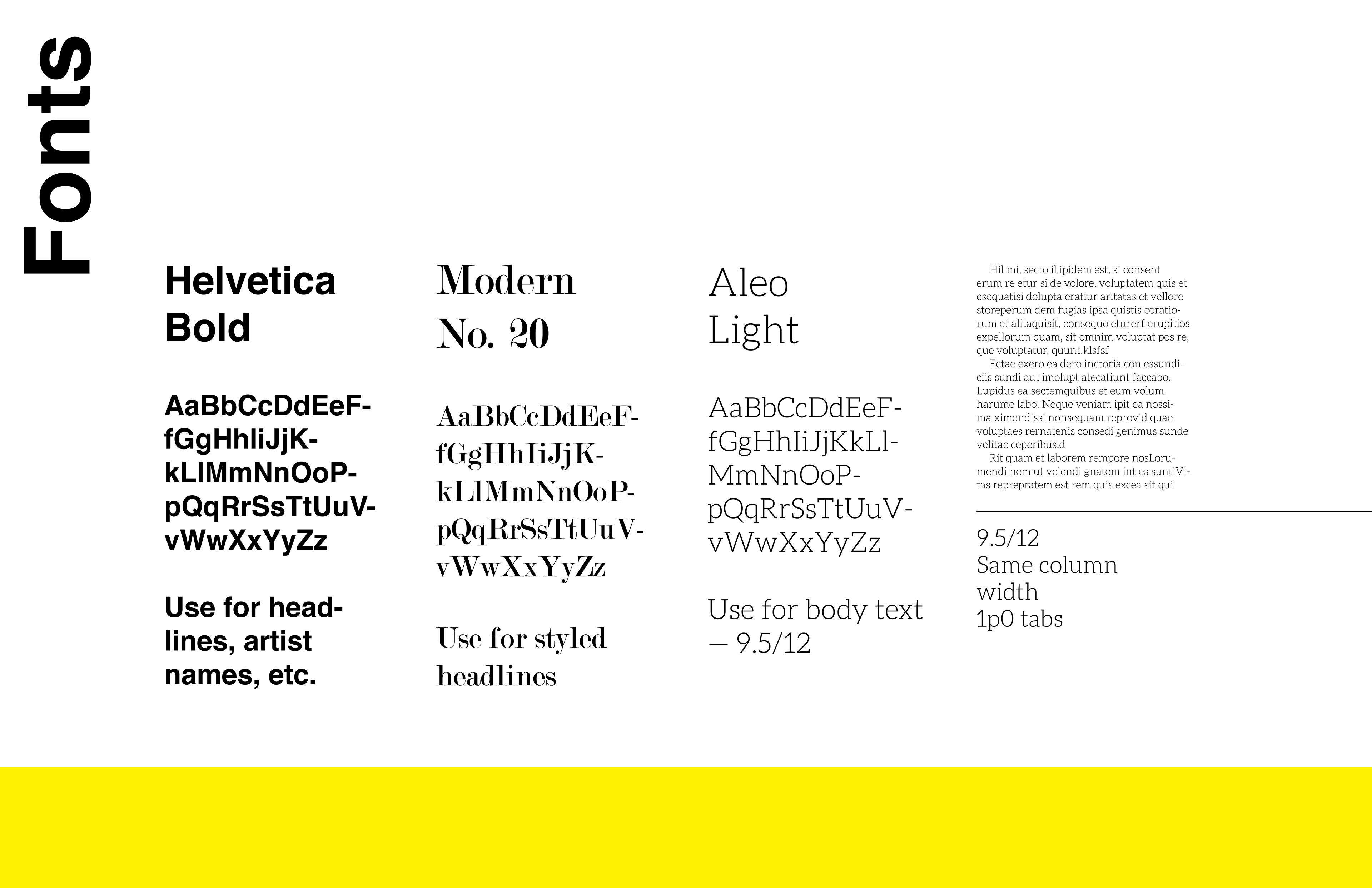
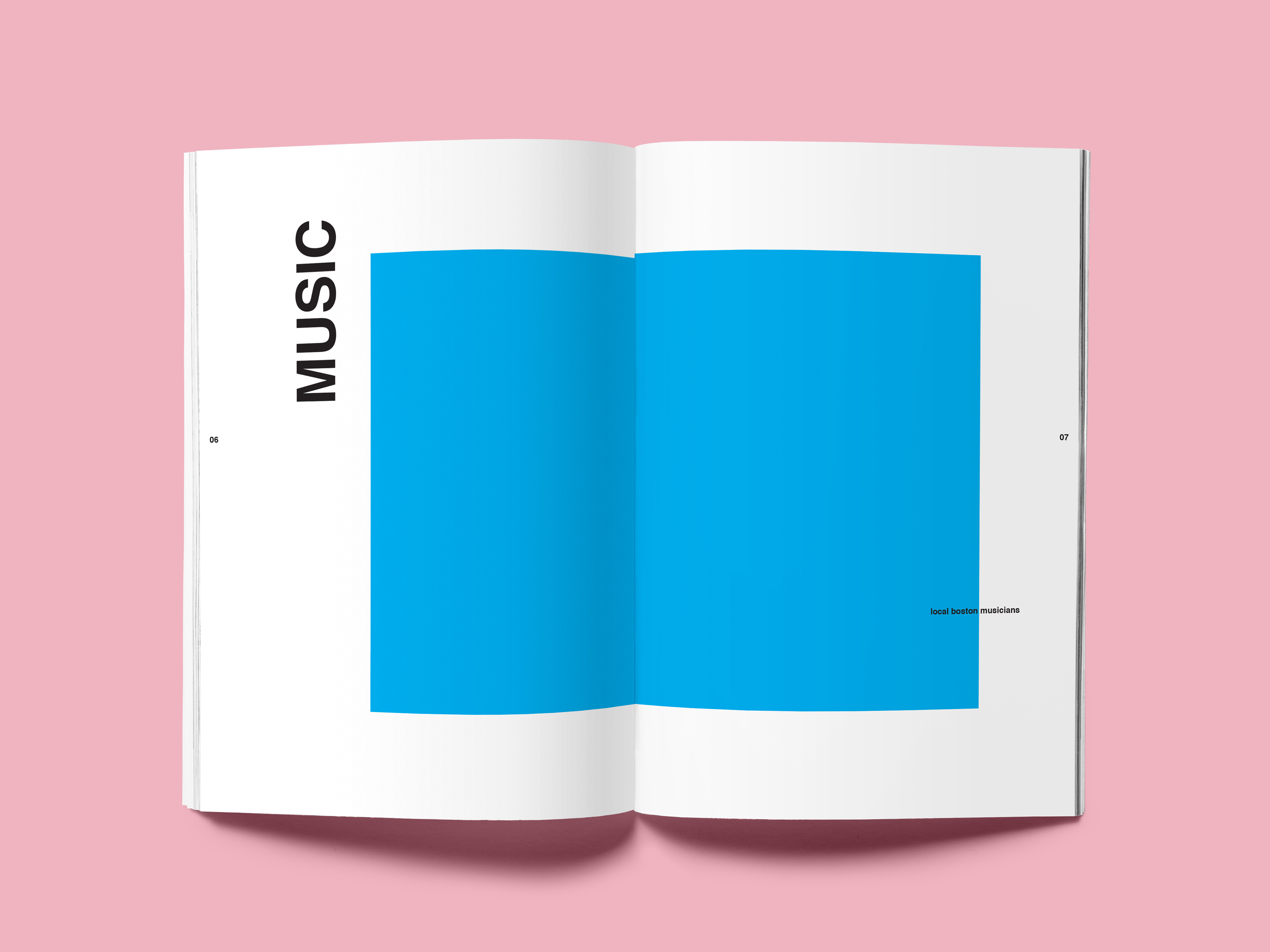
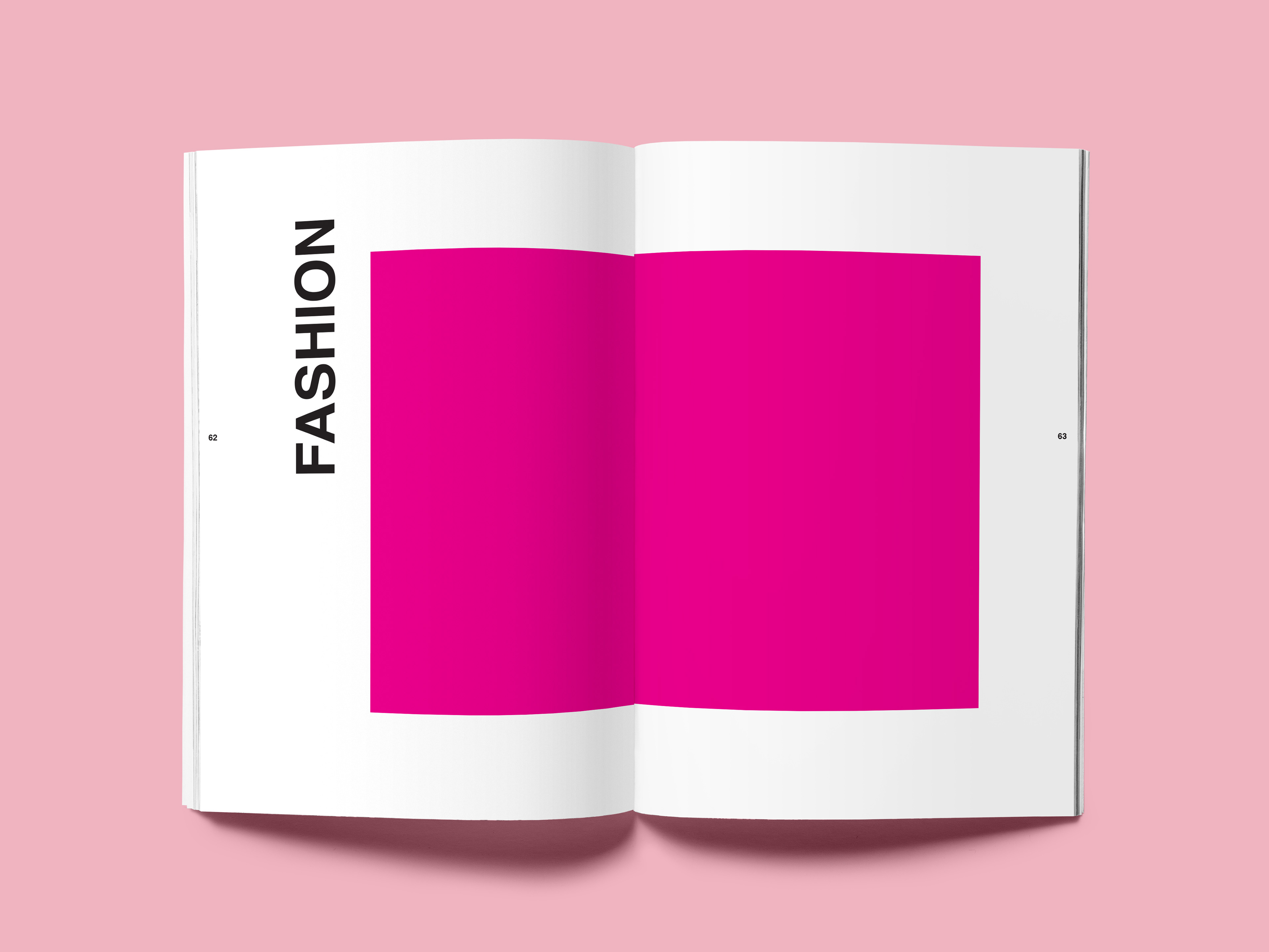
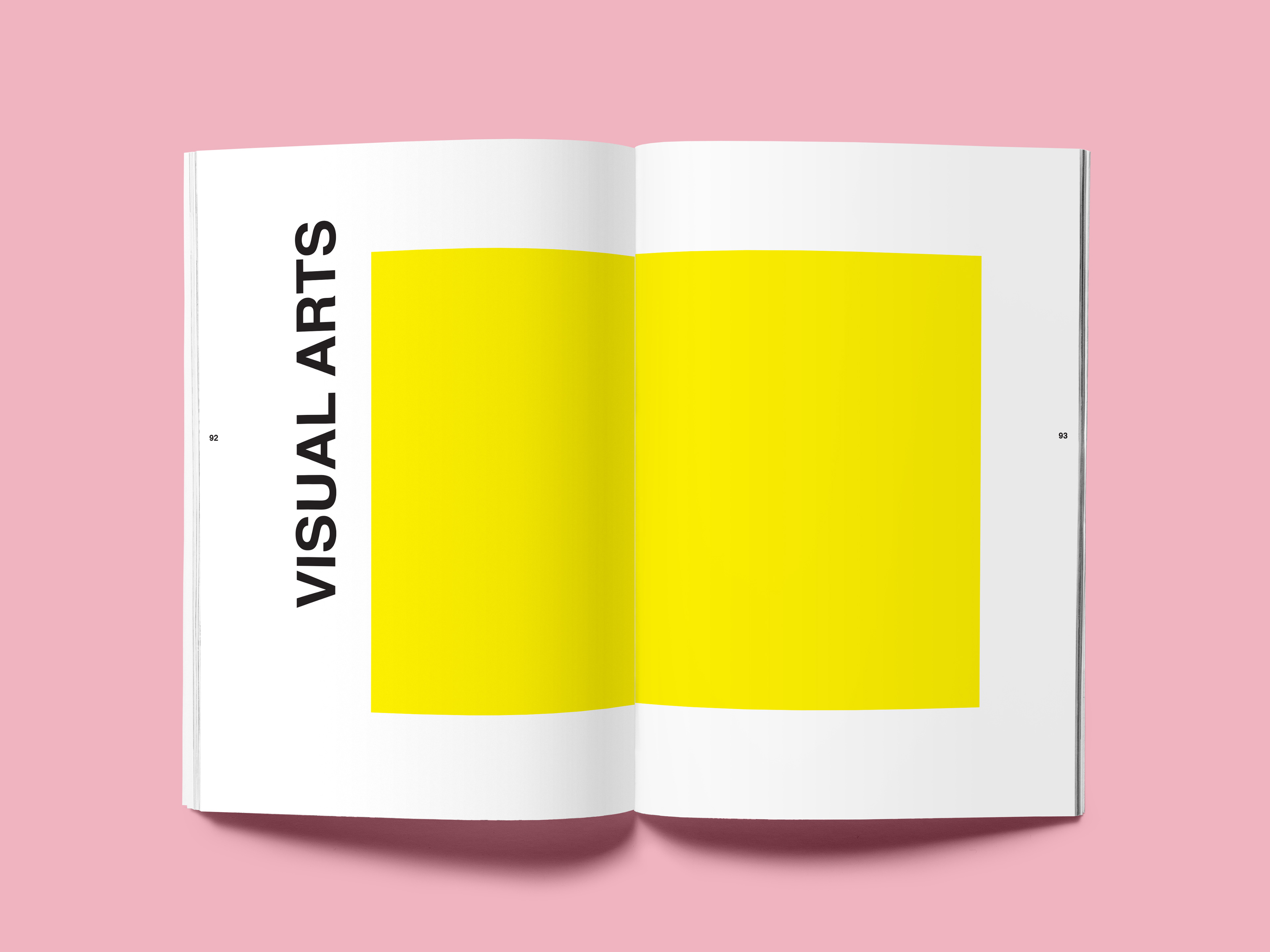
I created a short style guide for my team of designers (there's four of us overall). I decided to pair Helvetica Bold, for large headers or captions, with Aleo light as a body font. These two typefaces aren't necessarily bold or eye-catching; rather, they sort of blend into the design, and force readers to focus on content rather than typography. But, I also added the typeface Modern No. 20 as an option for designers as well, because I felt the serif could be used sparingly to emphasize specific headlines or special foci.
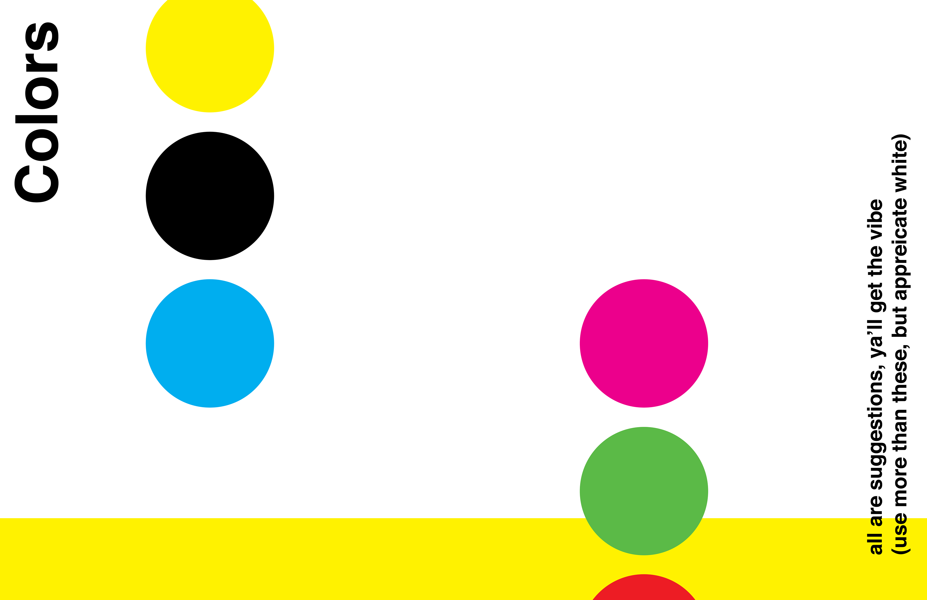
I chose bold, bright colors to utilize throughout the magazine. Not every page uses these colors — I didn't want to limit our designs to that great of an extent — but the colors are used sparingly throughout, just enough to bring them together. Our audience is mostly young, and the magazine has an inherently alternative feel because of the artists we choose to cover. Thus, I felt like these bold colors would play to our audience well, and emphasize the youthfulness of our background and artists.
